
Salesforce Communities are great. They’re a quick and effective way to expose certain back-end data to the masses.
Want to give your customers an easy way to update their details? Sure! Want to reduce the strain on your support services by opening up knowledge articles to the public? No problem. Want to enable conversations between your customer base? It can do that too!
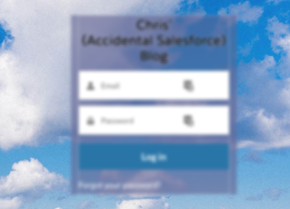
But when it comes to the log in page… Well, I personally think the important pieces can get lost in the background image.
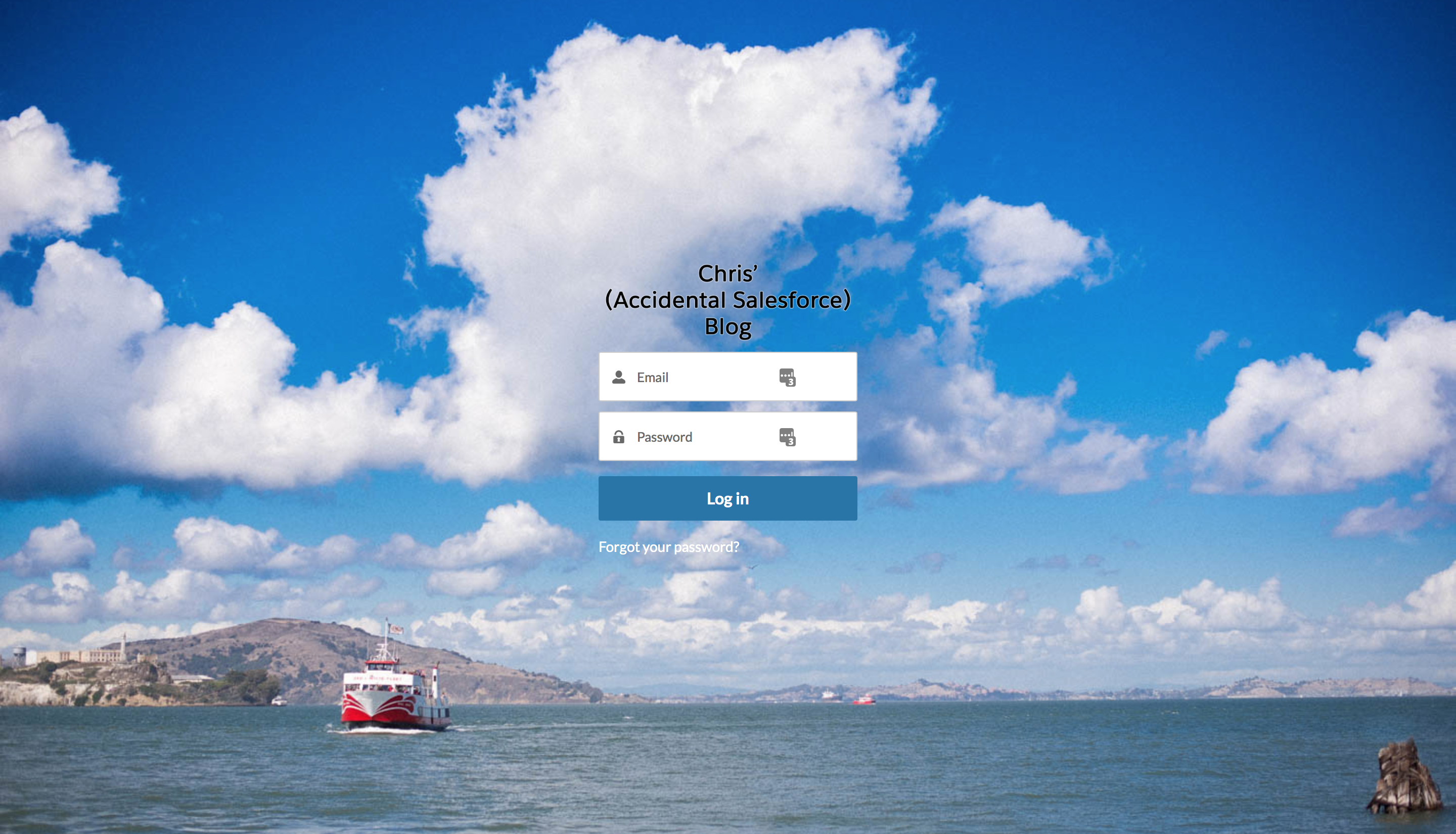
This isn’t a problem if you have a plain background. But if you have an image as illustrated above, it can really impact the legibility of the “Forgot your password?” link.
I hit this problem recently with a few Community Cloud projects I’ve been working on. I needed an elegant way of improving the separation of the login components against the relatively busy background image that was provided to me. Looking for inspiration, I decided to do a little Google image search for “login pages”. One repeating theme was the idea of a box surrounding the username, password and login button. Almost mimicking a window on a computer. Scrolling a bit more, I stumbled upon a few showing off a nice frosted glass effect, I didn’t need to look any further. I was sold.
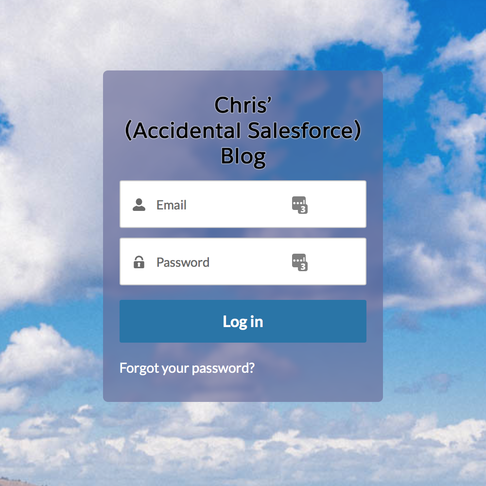
I knew that was the perfect way to separate the interactive pieces from the background. And the customer agreed, which was a silly and risky move, as I didn’t know if it was even possible to recreate. Thus began my mission to transform the login page to look a little something like this.
I’ll spare you the details where I searched high and low across many a webpage for instructions detailing how to actually achieve this. Long story short, I had to pull bits and pieces from a few sources, which I’m embarrassed to say, I didn’t note down at the time.
But on the plus side, I’m going to explain how I achieved this, so you can easily copy and paste (and maybe even tweak).
To begin, you need to get to your Community Builder and hit the Branding button (second icon on the menu). Reminder to self, this changes in Spring ’18, so I need to update it. If you’re reading this post Spring ’18, Chris is being lazy!
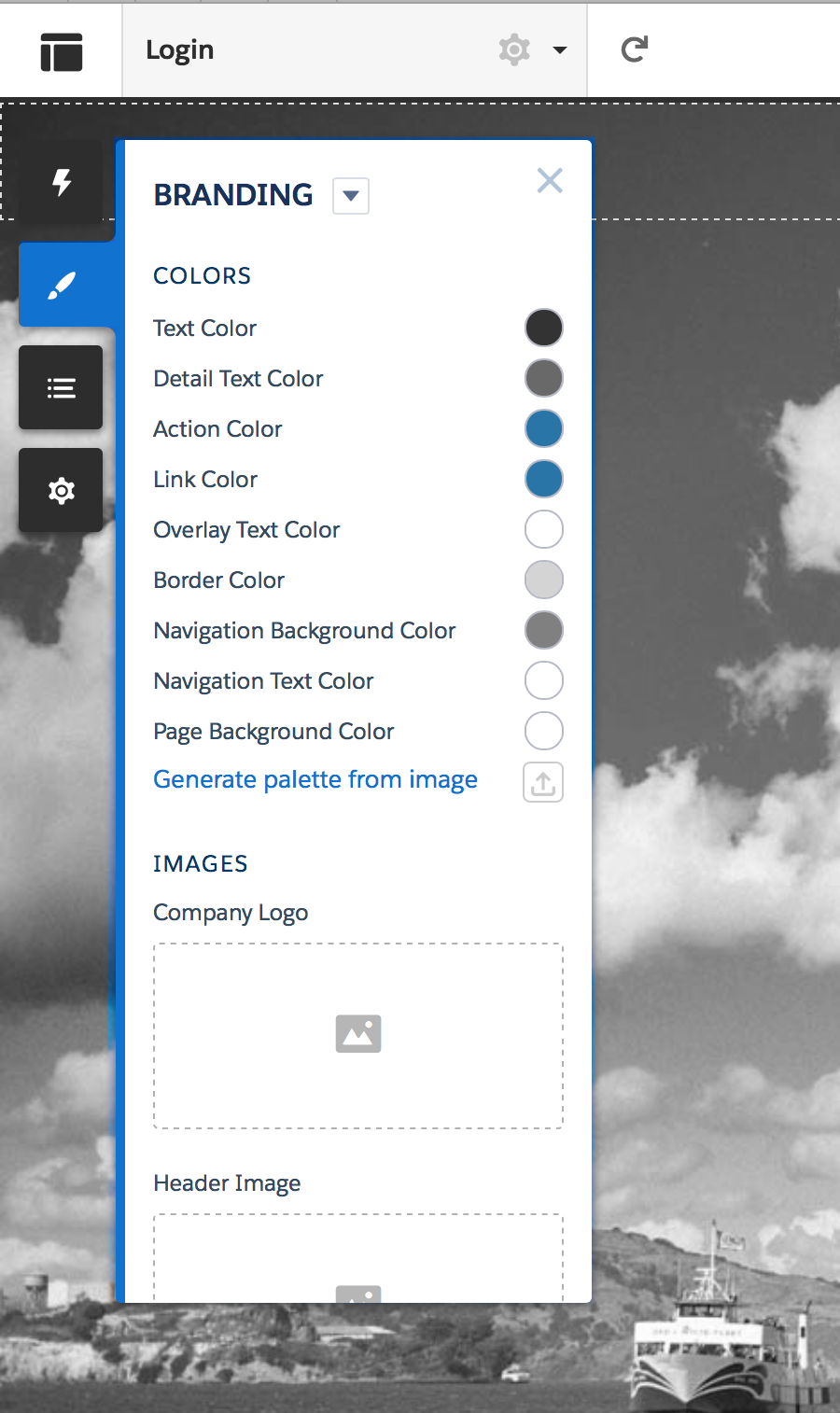
From there, click the down arrow and you will be presented with a “Edit CSS” option. Selecting that will open up a window to enter some CSS overrides. Depending on the maturity of your Community, this may be blank, or it may have a lot of styling (design code) in it. If there is anything in this window, take a copy of it! There is no “undo” mechanism here and you could irreversibly break something.
Next, you need to paste the following snippet in. I’ll explain what it does next.
.salesforceIdentityLoginBody2 .cCenterPanel:before{

background: inherit;
position: absolute;
left: 0;
right: 0;
top: 0;
bottom: 0;
box-shadow: inset 0 0 0 3000px rgba(100,100,150,0.6);
filter: blur(3px);

}

.salesforceIdentityLoginBody2 .cCenterPanel{

background: inherit;
position: absolute;
overflow: hidden;
padding: 20px 5px 20px 5px;
border-radius: 5px;

}
Hit Save. Hit Publish. And test. The resulting login page should look like the following.
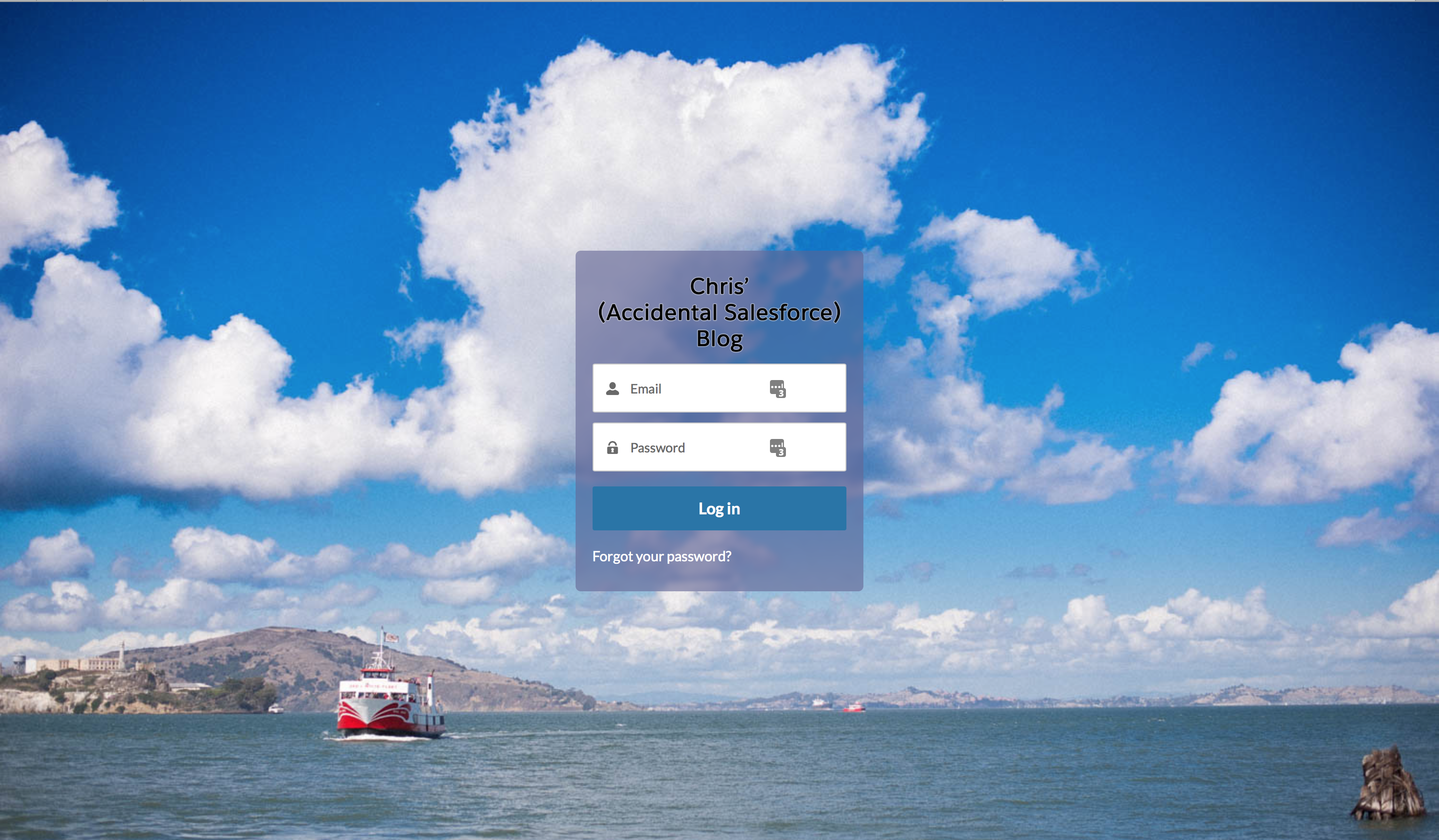
Ah, much better. But how does it work? Salesforce constructs the page into distinctive parts. The login page is referred to as “salesforceIdentityLoginBody2” and the inputs/buttons are “cCenterPanel”. That gives us the two classes we need to to open our CSS.
.salesforceIdentityLoginBody2 .cCenterPanel{
Next we place the blur effect into the this area.
background: inherit;
position: absolute;
left: 0; right: 0; top: 0;  bottom: 0;
box-shadow: inset 0 0 0 3000px rgba(100,100,150,0.6);
filter: blur(3px);
}
The parts of this to note (as you can easily change to suite you tastes) are the fourth and fifth lines. The fourth line controls the opacity and tint of the glass. In this case, I have a slight blue tint at 60% opacity. If you want to have a different colour, all you need to do in adjust the three sets of numbers. The fifth line should be self explanatory as it controls the strength of blur effect. In my experience, the lower the blur, the better (less is more).
If we just apply this part, the page blurs the centre and all the elements within it.
It’s not very elegant and you can’t actually read anything important. To fix this, we add the word “before” to the class declaration.
.salesforceIdentityLoginBody2 .cCenterPanel:before{
This small, but vital change blurs the background before rendering the other elements on top. Finally, we need to restrict the edge of the blur effect, to improve the illusion that we’re looking at a pane of glass. This code does just that, with an additional effect.
.salesforceIdentityLoginBody2 .cCenterPanel{

background: inherit;
position: absolute;
overflow: hidden;
padding: 20px 5px 20px 5px;
border-radius: 5px;

}
The final line, border-radius, adds a curved corner to the bounding box. If you remove this line, the box will have perfectly straight lines. Increasing the number, increases the curvature of the corners. The example below is set to 25px.
Putting it all together, you end up with a rather spiffing looking login page, if I do say so myself.
Please feel free to take, use, improve and share! If you have any nice tips or tricks to make this effect better, please drop me a line. I’m always happy to learn!!
Addition 24/01/2018 – I’ve since discovered that the blur effect does not work in Microsoft Edge or Internet Explorer. A little digging has revealed that support was dropped around IE9. As a temporary workaround, I added the following CSS override to target these browsers and darken the box to make the text and elements more readable:
@media all and (-ms-high-contrast: none), (-ms-high-contrast: active){

.salesforceIdentityLoginBody2 .cCenterPanel:before{

box-shadow: inset 0 0 0 3000px rgba(100,100,100,0.6);

}

}

@supports (-ms-ime-align:auto) {

.salesforceIdentityLoginBody2 .cCenterPanel:before{

box-shadow: inset 0 0 0 3000px rgba(100,100,100,0.6);

}

}