A Classic Look
Salesforce started out as a business tool for companies doing B2B sales. The data was presented in a simple and clear form factor. Everything you needed to get to was right there on the screen, with a minimum of fuss.
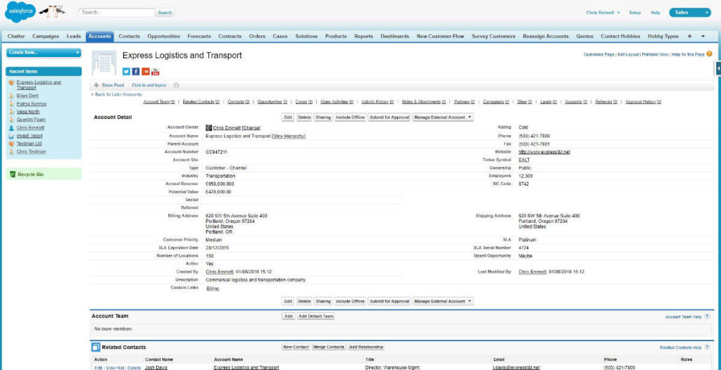
Prior to this, users were more familiar with bespoke apps installed on their hard drive and in many cases, a “green screen” computer terminal. Having the data available wherever you could get to a web browser was a gigantic leap forward. Having full control over how that data was presented and how it behaved, even more so. But, at the end of the day, the interface was still a list of fields, tightly packed.
In the time this interface was designed, the smartphone revolution took place. Prior to the iPhone’s release, most touchscreen phones rendered websites in full using a stylus to navigate and click around the tiny 3 inch display. When 2007 came, everything changed. Apple released a new phone with a new design ethos – no stylus. All of a sudden, website design started to gear towards large buttons and minimal features that were actually useful on a small screen. A functional but packed page was of no use to anyone on a mobile.
The usability of technology also took a leap with the iPhone, although one could argue Windows 95 started the trend. Mobile phones often came with a small manual to guide you through the various menus, functions and features. The iPhone came with a very brief leaflet (“Finger Tips”) while the rest relied heavily on the intuitive UI and considering my technophobe mother is the (debatably) proud owner of an iPhone and iPad demonstrates that a good design needs no instructions.
Largely, Salesforce Classic needs instructions. You can design it in such a way that the workflow moves in the right direction of the “business process”, but the interface doesn’t scream intuitive.
Lightning (Experience) Strikes
“If we were back in 1999, but had all of the technology available we have today, what CRM would we build? The result is Lightning.” In a very tiny nutshell, that’s what Salesforce say about Lightning Experience (LEX).
The slightly longer version covers these points:
- Lightning provides more productivity out of the box
- Lightning makes it easier to customise and develop faster
- Lightning enables the extension of functionality via the AppExchange
While that’s all good and makes for some nice marketing fodder, what’s the actual impact of Lightning? How do these factors affect the end users, the customers and the backend support team?
Here is the same record as above, this time in Lightning. As you can see the details are much bigger and easier to take in quickly at a glance.
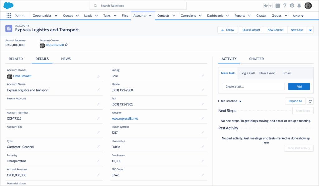
You’ll probably also notice on the right hand side, an area where you can quickly take actions against this record. While you could create tasks, events and log calls in the Classic view, this would need to be done at the top of the page resulting in awkward scrolling to see the details whilst you type. Now, the details sit along side the Activity/Chatter pane – making for a more intuitive experience. The Related Lists that were usually at the bottom of the Classic layout have now found themselves under a tab, along with (Account related) News.
In Classic, you could change the look and layout of the page thanks to the magic of Visualforce. The downside to that is it required development work, an idea that somewhat went against Salesforce’s mantra of “clicks not code”. In LEX however, this is all replaced by drag and drop features. You now have full and easy control over what goes on your page and where. Don’t want the News tab? Throw it out! Want to just see the record details and a few Related Lists? you got it.
The above video demonstrates just how easy it is to prototype and deliver experiences that are useful to the user. Creating a brand new record layout is now as quick and simple as creating a new field or data validation rule.
While these record pages are only available on the desktop, you can create similar pages called Lightning Apps that are available on any device. The brilliance of the App pages is that their layout automatically reformats depending on the device and even its orientation. Build once, and it’s reusable across the board. A philosophy that’s key to the Lightning Experience.
Components of a Reusable Ecosystem
The building blocks that make up a Lightning page are called Components. They’re individually programmed pieces that can be placed wherever you want and can be as simple or as complex as required.
The idea is that you write once and use it over and over. When time comes to update the component, you open your trusty development console, make the changes and viola! Every page that uses that code is instantly updated. Similarly, if Salesforce make changes to their stock components, you automatically see the changes throughout the entire org.
These components also have a trick up their sleeve. Let’s say you need to display a month long calendar on the Opportunity page and a week long one on the Account layout. Since the output is different, that would traditionally be two separate pieces of code that would both require maintaining. With Lightning, we can present the App designer with an option of week or month, resulting in one maintained component – and the added bonus of quickly changing the configuration as needed.
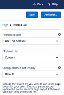
In the example above, we added a stock component called “Related List”. When this was placed on the page, we were presented with the following configurable options. By not baking in the configuration, we are able to tweak the same code over and over, resulting in quick deployment.
Last but not least on components, thanks to the drag and drop nature of the App Builder, we can quickly rearrange the layout without needing to worry about breaking the code and whether or not we have the right number of </div>s.
Features Features Features!
It doesn’t end there though. Salesforce is committed to Lightning as the platform’s UI going forward. Over 500 features are exclusively available in LEX and that number will grow as Classic is maintained but not grown. There’s still a big gap in functionality between the old and new interface, but Salesforce are working hard to close it and in some cases, persuading customers to change their way of working. I’ve personally been using Lightning exclusively for the past 8 months and there have only been a handful of times that I’ve needed to pop back into Classic. For me, the benefits far outweigh the few missing features.
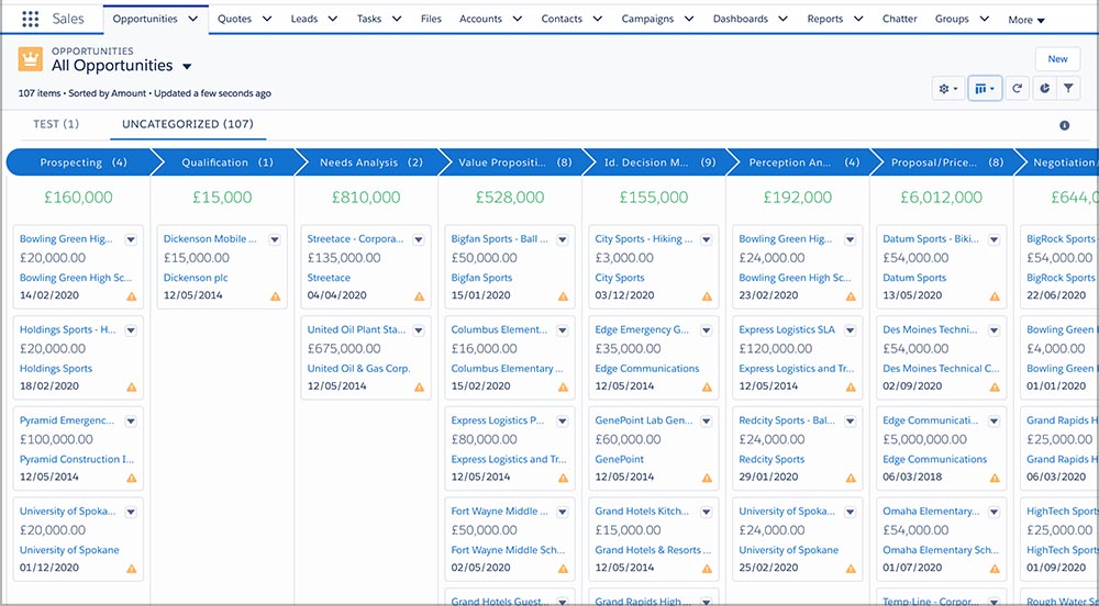
The ability to turn any date field into an event on a calendar, the Sales Path which guides the user through a business process and the Kanban List View (below) are likely to never be available in Classic. These are transformative features that you can quickly grow to rely on and make the whole experience more intuitive and friendly.
In and Out
The new features all look very shiny and exciting, but what about the companies that have heavy investment in Visualforce pages? They can come along too! With a tiny bit of tweaking, they can give their old code a new lick of paint and make it available as a Lightning component. While it will be beneficial to rewrite the code when time permits, as an immediate stop gap, those trusty legacy features can be pushed into LEX using “Lightning In”. The beauty of which is that you can ensure classic users still see the old skin, whilst those on the new interface else see the Lightning layout.
For those finding themselves on the opposite end of the stick, with Lightning Components they need to make available to Classic users, don’t worry, “Lightning Out” is ready and waiting. While this won’t change the look of the component (i.e. it won’t fit in with Classic), important business functionality can be made available to legacy users and could even ease them into the look and feel of Lightning.
The other important thing to note is that Visualforce isn’t going anywhere. Salesforce will continue to support it as a vital piece of Classic and LEX. Smart move. A lot of longtime customers will be holding off on Lightning given the massive redevelopment time required. This way, all they need to do is make the jump and bring Visualforce with them.
Bold New World
It is scary though and it’s a big change. The interface is different. The functionality in many cases is different. It’s a leap forward in the way you interact with your data at the desk and thanks to mobile, on the go. If you’re using Salesforce, at some point you took a huge leap forward when you decided to go into the cloud. Now if you’re still using Classic, you are denying yourself an even bigger leap as you’re not taking advantage of everything that current technology has to offer.
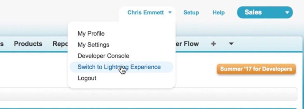
All you need to do is click on your name and then “Switch to Lightning Experience”. I dare you.